I started a new project in Odin recently.
That project became Vigil, a native Odin workspace browser.
The exact product is not really the important part for this post though. The rough idea was to take something that mostly exists on the web and make it work as normal local software.
One constraint I gave myself pretty early was software rendering.
There are a few reasons for that. Software rendering is very appealing when you want a smaller end product, fewer moving pieces, and a simpler cross-platform story. You write pixels into a buffer and now the main hard part is pushing that buffer into a window.
Obviously that sentence hides a lot of pain.
The pain starts once you want the UI to look good.
TLDR
This post is basically the long version of this:
- Runtime-rendered effects are hard to make cheap in a software renderer.
- SDF rendering was too per-pixel for the kind of UI I wanted.
- CPU vector rendering worked for simple assets, but complex UI components still got expensive.
- Image rendering with 3-slices and 9-slices ended up being the practical runtime path.
- The real problem then became asset generation, slice metadata, themes, states and atlas output.
- SVG and Affinity both helped for a while, but neither felt like a good source of truth.
- The result was Micro Vector Graphics, a small text format and Odin toolchain for generating UI assets, validating them, rendering them, packing them into atlases and keeping the metadata next to the art.
Software UI
I like making UI, but every time I do it in my own projects it tends to drift into the same direction.
Flat shapes, clear borders, maybe some shadows, maybe some color states. It works, but it also starts feeling like every project is carrying the same visual constraint.
With software rendering that constraint becomes even stronger. The CPU has to do all the work, so anything fancy has to be paid for directly. You do not get a fragment shader where every pixel can run its little program in parallel. You just have your code and the CPU budget for the frame.
Most software rendered UIs I have seen end up in that flat style for a reason.
At some point the most exciting effect is a shadow.
That was not really what I wanted for this project. I wanted to use this as a chance to go outside of my usual programmatic UI comfort zone and try something more asset driven.
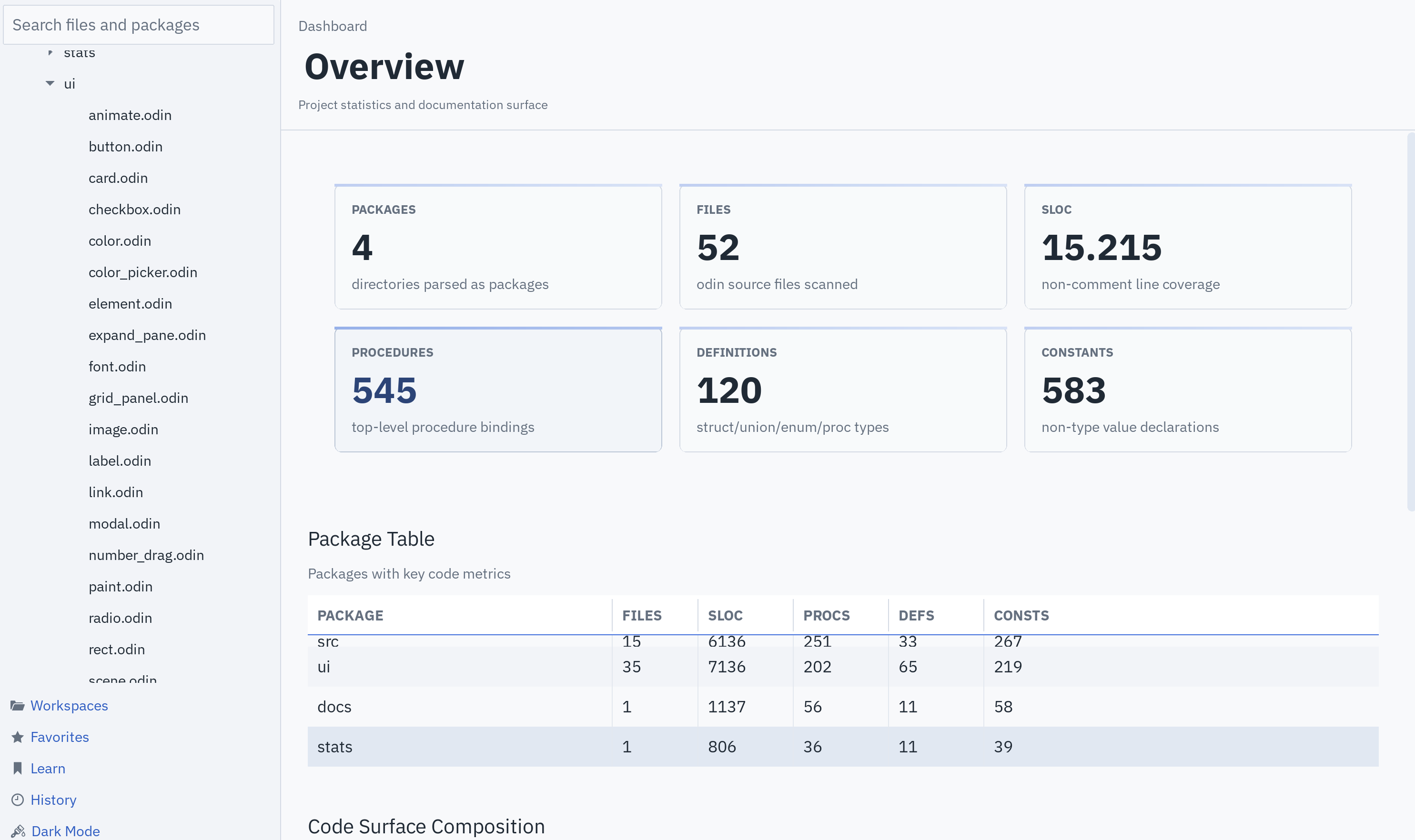
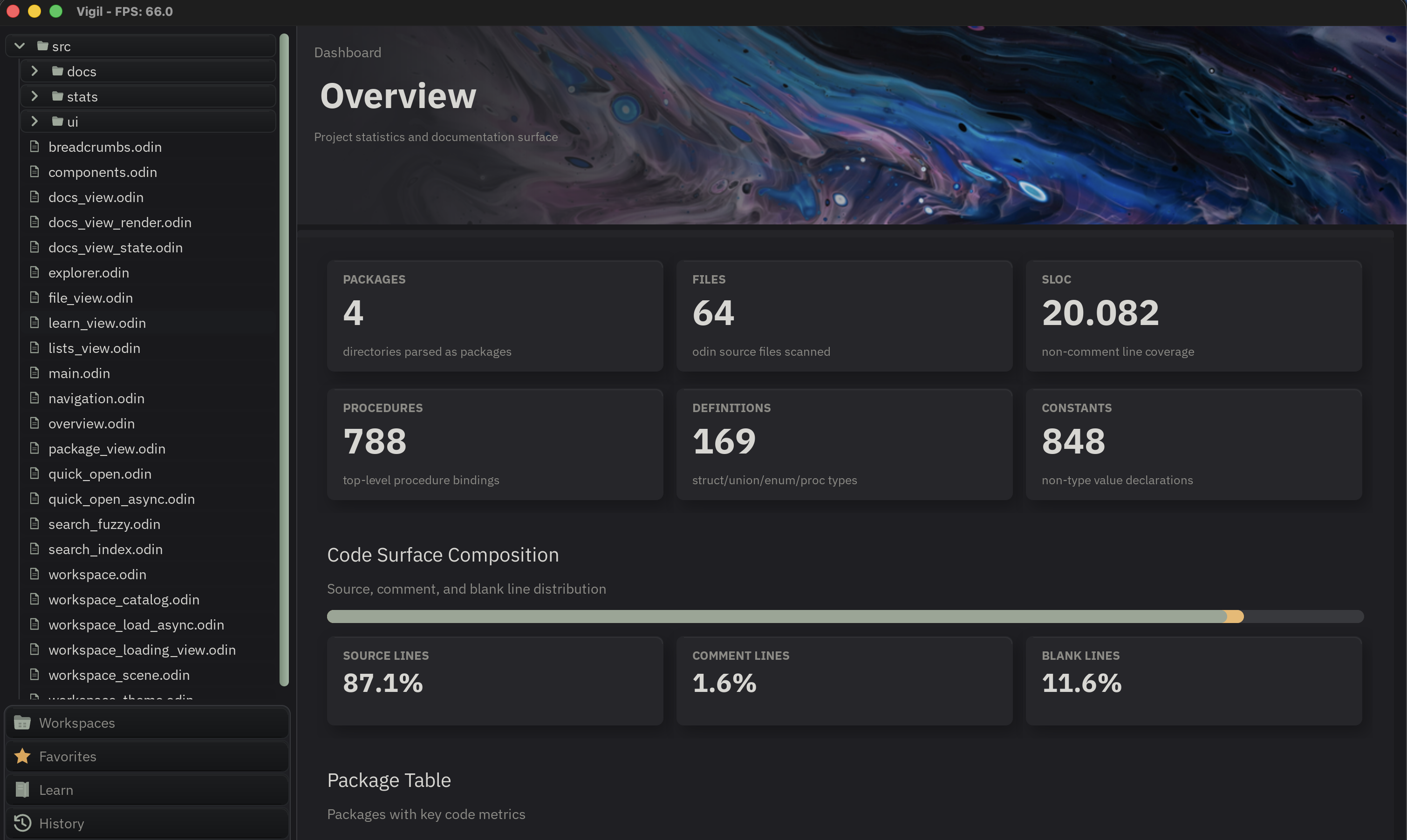
This was roughly the starting point. Functional, clean enough, but still very much in the flat programmatic UI direction.
The problem is that I am not an artist.
So the actual question became:
- How do I make a software rendered UI look good?
- How do I avoid spending all my CPU time on effects?
- How do I get good assets without being good at making art?
- How do I keep this workflow nice enough that I can actually keep using it?
That last one became much more important than I expected.
SDF Rendering
The first thing I tried was SDF rendering.
This seemed like the obvious path if I wanted nicer UI through effects. Signed distance fields are a really good fit for rounded rectangles, smooth borders, outlines, soft shapes and all that kind of stuff.
So I spent somewhere around one or two months trying to get SDF rendering working on the CPU in a way that could still hit something like 120 FPS.
The issue is pretty simple: SDF rendering is per pixel.
In software rendering, once you start doing anything interesting per pixel, you kind of lost.
That sounds harsh, but that was my experience here. The simple case gets you rounded corners. Nice. Wow, round the corners. But then you start adding more interesting SDF operations and the cost keeps going up.
Caching and scaling also did not really save it for my use case. The whole point was to have flexible UI, and once the effect is based on computing each pixel, you are back in the same CPU problem.
Maybe this can be done better. If someone has a CPU SDF UI renderer that proves me wrong, please let me know.
For me this ended with a pretty boring conclusion:
SDF is great, but for this kind of UI I only really want it on the GPU.
Vector Rendering
After that I looked at vector rendering.
This felt a little more realistic. Vector rendering on the CPU is very common. Text, icons, small scalable UI details, that kind of thing.
The tradeoff is interesting:
- Doing very fast vector rendering on the GPU is hard.
- Doing vector rendering on the CPU is much simpler.
- Doing complex vector rendering on the CPU is still expensive.
I tried a separate side project where I took PlutoVG, brought it over to Odin, and optimized the hell out of it.
That actually went pretty well. I got it to a point where the simple cases felt good.
But that is also the problem. Simple cases.
If all I wanted was icons, basic shapes, and small scalable details, that would probably be fine. But the whole point of this project was to move toward complex UI assets. Once the vector description for a component gets more complicated, the renderer still has to walk all that data and rasterize it.
So now the problem looked like this:
- SDF is too pixel-heavy.
- Vector rendering is nice for simple assets.
- Complex vector assets still become a CPU problem.
I was still trying to make a software rendered UI look less boring, but all of the runtime-rendered approaches pushed me back into the same corner.
Image Rendering
The next question was: what is actually cheap in software rendering?
Images.
Not free, obviously. But if the image is already in the right format for the screen, drawing it can be close to copying pixels from one buffer into another.
That is still work, but it is very different work from evaluating a shape or effect per pixel. Instead of computing a fancy shadow across a huge region, you can copy the pixels that already contain the shadow.
Scaled images, stretched images, alpha blending, format conversion, all of that can still get expensive. But compared to calculating complex effects while drawing the UI, image rendering felt like the practical path.
This is where I started looking into 9-slice rendering.
I mostly know 9-slice textures from game UI. Android also has the idea with nine-patch images. I am not sure how common it is in modern application UI outside of that, but the technique itself is very simple.
In short here’s how it works:
- Take an image.
- Split it into 9 regions.
- Keep the corners fixed.
- Stretch the edges in one direction.
- Stretch the center in both directions.
Now a single asset can become a button, panel, text box, or whatever else, while keeping the corners and borders looking correct.
For software rendering this seemed very promising. The renderer does not need to know how the button was made. It only needs to copy and stretch image regions.
The tradeoff is that you need control over the asset.
You need to know where it can be sliced. You need metadata. You need some kind of pipeline that takes an asset and turns it into something the renderer can draw quickly.
So the problem moved.
It was not “how do I render a nice button from scratch every frame?” anymore.
It became “how do I get good button assets, with correct 9-slice metadata, without going insane?”
Slice Types
There was also an optimization problem here that came up before .mvg.
Not every asset needs a full 9-slice.
Rendering 9 image regions is definitely more expensive than rendering 3 image regions. For something like a horizontal button, you often only need:
- left cap
- stretchable center
- right cap
Same idea vertically for something like a scrollbar.
So the asset types started looking more like this:
- Fixed asset, for icons or anything that should not stretch.
- 3-slice horizontal, for buttons and similar components.
- 3-slice vertical, for scrollbars.
- 9-slice, for panels, text boxes and regions that resize in both directions.
This is a good optimization, but it also makes the asset description more important.
The renderer does not just need “some slice values”. It needs to know what kind of asset this is, what resize rules apply, and how that should later be packed into the atlas.
This is where the metadata stopped being a small extra file and started becoming part of the actual asset.
Pixel Art
The first 9-slice experiment used pixel art style assets.
This was useful because it let me test the renderer and the idea without building a whole asset pipeline first. I made a separate project just for 9-slice rendering and was surprised by how good it flowed.
After that I moved the 9-slice renderer into the actual UI project.
The UI code was already in a decent state, so the main job was just letting the software renderer take 9-slices as another draw path instead of custom rendering every single little UI detail.
That part was pretty quick.
The bad part was that pixel art 9-slices did not look good for this UI.
Pixel art has a strong style. If the whole application is not built around that style, it starts looking cheap very quickly. So the renderer idea worked, but the asset direction did not.
SVG Pipeline
The next attempt was vector art.
The plan was to let AI generate SVGs for the UI components. Buttons, checkboxes, panels, inputs, all of that. Each component would be described by some theme file or prompt structure, and then the output would become source assets for a generated atlas.
The nice thing about SVG is that it is scalable. That solved one of the big problems from the pixel-art atlas workflow.
The earlier atlas was basically a fixed grid. Think 128x128 cells where everything had to be positioned correctly. It worked, but it was horrible to maintain. Any time a component changed size or needed a slightly different layout, the whole thing felt brittle.
With SVGs, the pipeline could be:
- Generate or edit SVG source assets.
- Rasterize them to PNG.
- Pack them into one atlas.
- Emit a manifest with exact positions and slice data.
- Let the UI renderer draw from the atlas.
That was a crazy win.
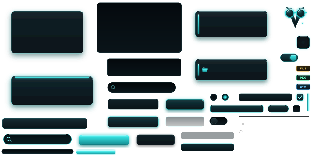
For the first time the UI started looking like something I was actually proud of. I had a dark theme and a light theme. I tried a few other directions too. The whole thing was still rough, but it was finally outside of the usual flat programmatic UI look.
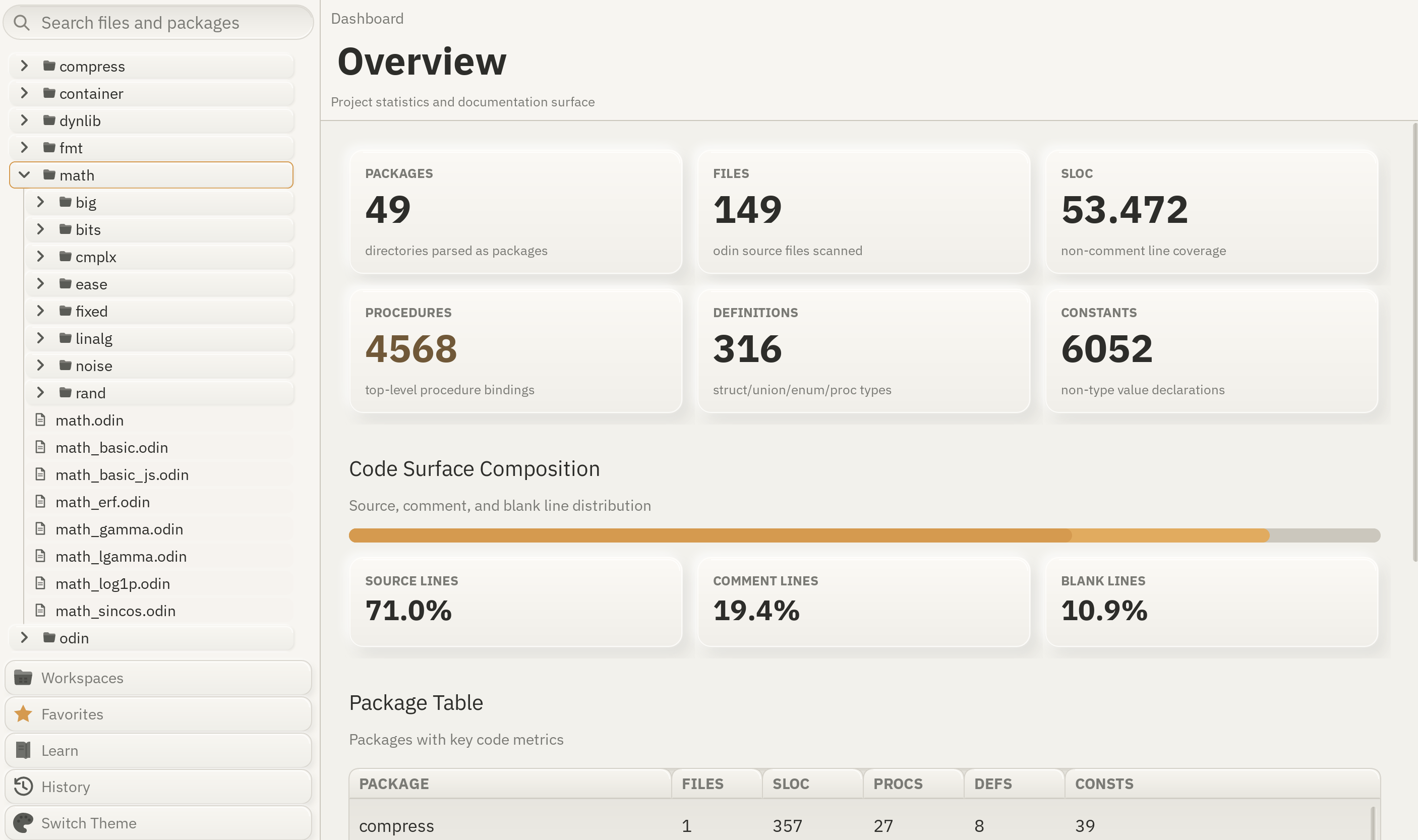
With that said, AI-generated SVGs are not exactly fun to work with.
AI can output SVG. It can also edit SVG. But it is not very good at keeping the file clean, understandable, or easy to iterate on. SVG is a large format, and once you start asking for more nuanced visual changes, the output can get weird quickly.
Still, this was the first version that felt like a success.
Metadata
The success did not last long before the metadata problem showed up.
An SVG alone is not enough for this renderer. I also need to know how that SVG becomes a 9-slice asset:
- Where are the fixed corners?
- Which region stretches?
- Which component state does this image belong to?
- What theme colors and fonts were used?
The pipeline ended up with something like this:
- One JSON file describing the overall components.
- One JSON file per theme with colors, fonts and theme-specific values.
- A Python script that generated the output for each theme.
- SVG files sitting next to all of that.
This worked, but it was very hard to follow manually.
AI could deal with it. That is the funny part. You can tell AI to update the JSON, regenerate the assets, change the SVG and patch whatever breaks.
But I could feel pretty quickly that I could not comfortably extend it myself.
That is a bad sign.
The workflow was not really mine anymore.
It was this pile of SVG files, JSON files and scripts that technically worked, but every small change had too many places where it could go wrong.
For example, what if I liked a theme but wanted to make it green?
That sounds like it should be easy.
It was not.
Affinity
At that point I started thinking maybe I should make at least one theme by hand.
I tried using Affinity and similar tools. Creating good-looking SVGs by hand was totally doable. That was not the hard part.
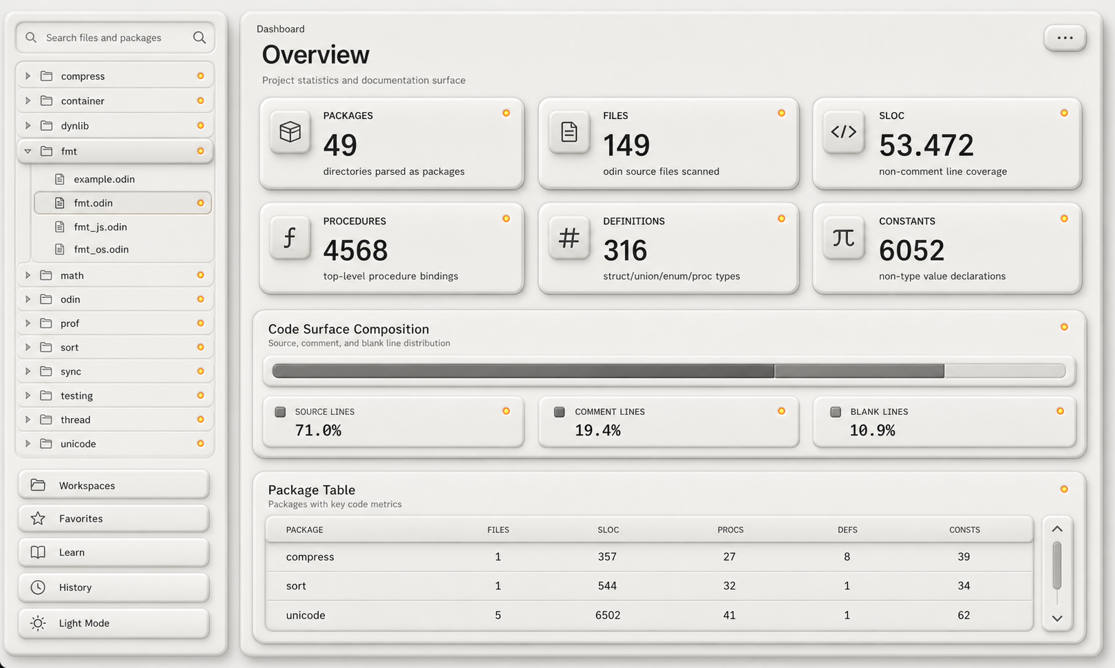
The hard part was realizing that these vector tools do not really use SVG as the source of truth.
They have their own document formats. In Affinity’s case, the real file is an Affinity document, and SVG is just an export format.
That matters a lot.
If I draw a rounded rectangle with a shadow, Affinity can represent that however it wants internally. When exporting to SVG, that shadow might become a bitmap embedded inside the SVG. That makes sense from the tool’s perspective because it can support effects that SVG shadows do not cover nicely.
But for my pipeline that is a problem.
Now the SVG is not really a clean scalable vector source anymore. It is a finite export. It can still scale in some ways, but bitmap-backed effects will eventually look bad.
The more I looked at it, the more obvious it became that the nice UI effects are tool-dependent:
- The shadow is not just a shadow. It is an Affinity shadow.
- The blur is not just a blur. It is whatever that tool decided to export.
I still tried to build a workflow around it.
One idea was to keep the whole theme in one Affinity document. Each component could live on its own artboard. I even added scripts to import the old SVGs into separate artboards.
That part was honestly pretty nice. Being able to see all components in one place, inspect them visually, and touch things up by hand was great.
Then the asset description problem came back.
What if I added an invisible layer that only exists for slice guides or component bounds? The renderer would ignore it, but my pipeline could read it.
- Possible? Sure.
- Nice? Not really.
I updated some importer code to handle ideas like that, but the whole thing started turning into its own toolchain.
And the scripting side of Affinity was not good enough for the amount of automation I wanted.
Then I hit an even dumber issue: Affinity and Inkscape were not reliably loading my SVG effects. Drop shadows and similar effects could just silently disappear.
I could not find a good way to tell the tool “please take this SVG shadow and convert it to your native shadow effect.”
So after spending a lot of time trying to make the Affinity workflow happen, it mostly felt like a complete time waste.
Metadata Editor
After that I thought: okay, screw the Affinity-centered pipeline. Let’s just build a tool for the metadata part.
The idea was simple enough:
- Point the tool at a folder of SVGs.
- Load the existing JSON metadata.
- Show each component visually.
- Let me drag the slice guides and edit the metadata in the application.
- Save the updated metadata.
This would at least make the slice and bounds editing less painful.
But the SVGs still had to be edited somewhere else.
So now the workflow was:
- Open the SVG in Affinity.
- Change it.
- Export or save it.
- Bring it back into the viewer.
- Fix the slice guides.
- Repeat.
That was not good either.
And I definitely did not want to build a full vector editor. Vector editing is hard. That would be a completely different project, and not the project I was trying to build.
So I scratched that direction too.
PNG Output
The next version was more pragmatic.
The split was pretty clear:
- Affinity is good at letting me visually author assets in one document.
- It is bad at being the automated, inspectable, metadata-aware source of truth.
So I tried moving the pipeline one step later.
Instead of trying to make SVG the editable format, I generated PNGs from the Affinity artboards at the scales I needed. Then the metadata tool worked on those PNGs.
This had some real benefits.
Now I was not looking at a perfect crisp SVG source and guessing how it would become a final asset. I was looking at the actual PNG that would appear in the UI at that scale.
Dragging slice guides on that final output felt better. I was editing the thing the renderer would actually use, not some idealized source that still had to survive export.
But the workflow was still way too much:
- Edit in Affinity.
- Run the export script.
- Populate the PNG folders.
- Open the metadata tool.
- Inspect the result.
- Adjust the metadata.
- Go back and do it again.
It technically worked.
I also do not think anyone besides me would ever tolerate it for this project.
This was the point where I felt pretty defeated. I had spent a lot of time thinking about the pipeline, building side projects, trying SVG generation, trying Affinity, trying metadata editors, trying PNG output.
And the result was still this slow back and forth workflow.
Micro Vector Graphics
On July 2, 2026 I started thinking about the problem from the other side again.
I wanted:
- a scalable format like SVG
- metadata
- AI-generated assets, because as stupid as it sounds, it feels really good to just say “make this button darker”, “make this theme green”, “try a more industrial look”, and get something back
But I did not want SVG.
So why not make a small format that does exactly what I need?
That became .mvg, for micro vector graphics.
The idea is not to replace SVG in general. SVG is huge because it has to be a web format, an interchange format, a drawing format, a text format, an animation-ish format, and a bunch of other things.
I do not need that.
For this UI pipeline I need something much smaller and more direct:
- Component dimensions.
- Simple vector drawing commands.
- Theme colors.
- UI-specific effects.
- 9-slice metadata.
- A format that is easy for AI to read and write.
- A renderer that can inspect the output quickly.
The format is just text.
That matters more than it sounds. It means AI can generate it easily, but I can also read it, edit it, validate it and render it without feeling like I am operating on some giant foreign format.
The big point is that the metadata lives in the same file as the drawing description.
That removes the most annoying failure mode from the SVG pipeline. I cannot change the component shape and forget that the slice metadata lives in a totally different JSON file. The component source is the component source.
Here is a reduced version of one generated button asset:
colors light

palette {
  surface = $slate2
  surface_raised = $slate1
  text_on_accent = #FFFFFF
  progress_fill = $blue9
}

asset button size 144 52 {
  type three_slice_horizontal
  outsets 10 9 12 11
  padding 22 15 22 15
  slice l 0 0 22 52
  slice r 122 0 22 52

  rect n01 10 9 122 32 radius 9 {
    fill linear 0 0 0 1 {
      stop 0 @surface_raised
      stop 1 @surface
    }
    relief_shadow 5 4 @text_on_accent 0.8 @progress_fill 0.13
  }

  variant hover {
    hide n01

    add rect hover_n01 10 9 122 32 radius 9 {
      fill linear 0 0 0 1 {
        stop 0 @text_on_accent
        stop 1 @surface
      }
      relief_shadow 5 4 @text_on_accent 0.86 @progress_fill 0.16
    }
  }
}
That is the kind of thing I wanted from the start.
The visual description is there, but so is the asset type, the padding and the slice data. It is readable enough that I can edit it myself, and strict enough that a tool can validate it.
There are also two kinds of color references, which ended up being important.
Built-in standard colors use $name, like $slate2 or $blue9.
Theme-defined values use @name, like @surface, @accent or @sans_bold.
That tiny distinction makes the format much easier to reason about. There is a base color vocabulary, and then there is the actual theme vocabulary a component is allowed to depend on.
AI Exploration
One thing I learned from all this asset generation work is that you need to give AI a way to inspect itself.
If it cannot render, validate, compare, or inspect what it made, it just guesses.
So one side of the .mvg workflow is really about exploration.
In short it looks like this:
- Ask for a component.
- Generate the
.mvg. - Validate it through the CLI.
- Render it through the CLI.
- Inspect the rendered output.
- Fine tune until it looks good.
That loop is much better.
Generate the component. Render it. Look at it. Fix it.
This can also become a very small AI skill. The skill does not have to know my whole application. It only has to know the .mvg format, the validation command, the render command and the visual expectations for the current theme.
The current CLI already has the basic loop:
mvg validate vigil/porcelain
mvg render vigil/porcelain --asset button --variant hover --out target/button_hover.png
mvg inspect vigil/porcelain
The fuller toolchain has the usual boring commands too, which is exactly what I wanted:
mvg fmt vigil/porcelain --check
mvg render-all vigil/porcelain --out vigil/porcelain/render
mvg contact-sheet vigil/porcelain --out vigil/porcelain/contact-sheet.png
mvg pack vigil/porcelain --out vigil/porcelain/pack
None of that sounds exciting on paper.
But that is the whole point. The workflow should be boring. The results can be fancy.
Everything is in Odin. I was also able to reuse parts of the earlier vector renderer work, so the previous experiments were not completely wasted.
After around three or four hours I already had surprisingly good-looking vector UI art coming out of it.
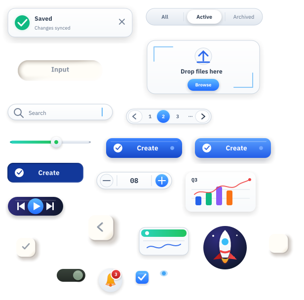
That was a weird moment.
I had spent so much time fighting SVG, Affinity and metadata syncing, and then the custom format started producing better results almost immediately because it was designed around the actual constraints.
SVG Conversion Test
The really promising test was taking the canonical SVG theme output I already had and converting that into .mvg.
This is not the workflow I want long term.
Long term I want .mvg to be the source.
But as a migration test it was very useful.
The rough shape was: take a theme reference folder with a contract.json, theme manifests, SVG files and icons, run an internal conversion pass, then validate and contact-sheet the generated .mvg theme.
The result was honestly much better than I expected.
It preserved the parts I cared about: component names, state variants, shared theme colors, fonts, slice metadata and the final renderable shape. It also turned paired SVG drop shadows into renderer-native relief effects where possible.
That is the part that made the whole thing feel solid. This was not just a cute hand-written button example anymore. It was a whole UI asset set coming through the pipeline.
The output from that conversion was also a little annoying in the best way.
It looked good enough that it made the whole SVG fight feel even more wasteful.
The annoying realization was:
- The art was there.
- The intent was there.
- The missing piece was a source format and toolchain that would stop losing meaning between every step.
Packing
The other side of the workflow is the final output pipeline.
This is the bigger picture:
- Read all
.mvgfiles. - Validate them.
- Render them.
- Inspect the rendered output.
- Pack the rendered results into an atlas.
- Emit the metadata next to the atlas.
That last point is important. The atlas and metadata are not two separate hand-maintained things anymore. They come from the same source files.
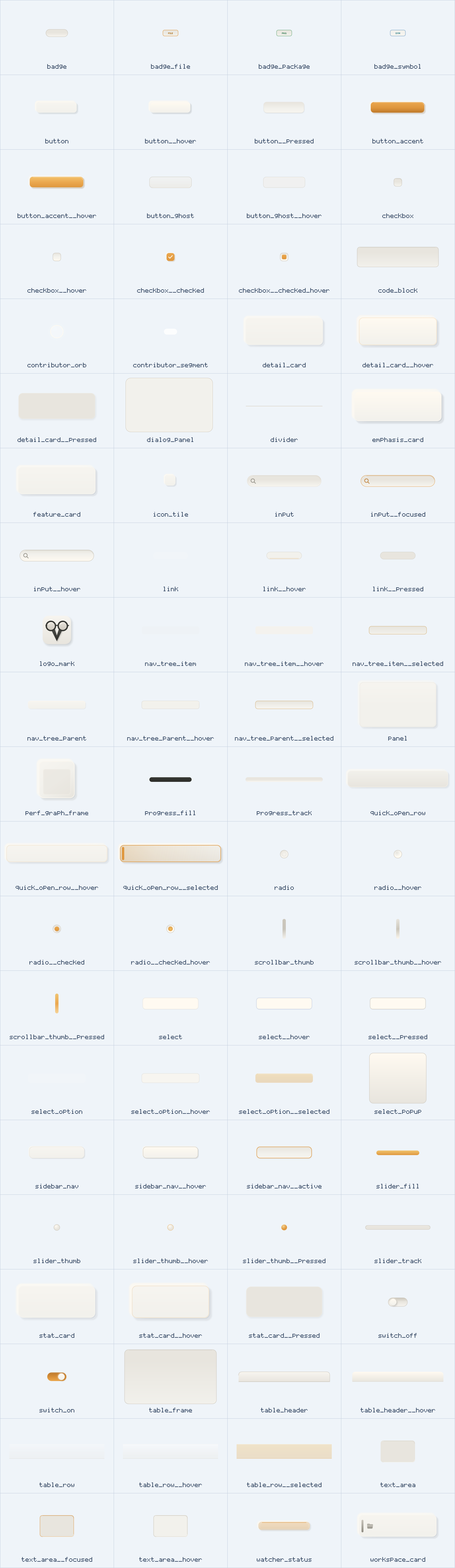
It also means the same assets can be generated at different scales. That was one of the reasons I wanted a scalable source format in the first place. The final renderer still uses images, 3-slices and 9-slices, but the source can stay flexible.
The packer emits [email protected], [email protected], [email protected], [email protected] and one layout file.
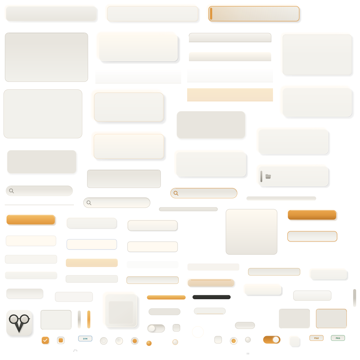
The layout is the part the runtime actually cares about:
{
  "schema": "mvg.pack.v1",
  "asset_count": 98,
  "atlases": [
    { "scale": 1, "image": "[email protected]", "width": 1208, "height": 1208 },
    { "scale": 2, "image": "[email protected]", "width": 2416, "height": 2416 },
    { "scale": 3, "image": "[email protected]", "width": 3624, "height": 3624 },
    { "scale": 4, "image": "[email protected]", "width": 4832, "height": 4832 }
  ],
  "assets": [
    {
      "id": "button",
      "type": "three_slice_horizontal",
      "padding": [22, 15, 22, 15],
      "slices": {
        "l": [0, 0, 22, 52],
        "r": [122, 0, 22, 52]
      }
    }
  ]
}
This is another reason I like having the metadata in the format.
The asset can say what it is: fixed, three_slice_horizontal, three_slice_vertical, or nine_slice.
The runtime can then choose the cheaper draw path when it exists, instead of forcing every component through a full 9-slice path.
That was the missing link from the earlier slice-type idea. The optimization only stays nice if the asset description travels with the art.
Renderer Effects
Another thing that became clear is that SVG is mostly vector graphics with a few effects bolted on.
UI often wants more specific effects than that.
Not huge fancy stuff, just small material details:
- shadows
- inner shadows
- glows
- sheens
- relief shadows
- inset relief
- pressed states
- organic edges
With SVG, every effect becomes a compatibility question.
- Does the generator write it correctly?
- Does the design tool import it?
- Does the rasterizer support it?
- Does it still look right after scaling?
With .mvg, the effect can just be part of my renderer.
That is the benefit of a custom format. It is not portable in the same way SVG is portable, but it also does not need to be. It only has to be good for this asset pipeline.
If I want global colors, I can build global colors.
If I want to switch one theme color and regenerate every asset, I can make that a first-class feature.
If I want a button shadow to behave in a very specific way, I do not have to convince SVG, Affinity, Inkscape, a Python script and a metadata file to agree. I can make the renderer do it.
That feels like the first pipeline that actually matches the project.
Themes
The part I am still improving is themability.
The simple version is global colors. Change one color, regenerate the assets, inspect the result.
But I think it can go further than that.
The renderer already pushed me in this direction earlier. The pipeline naturally wanted:
- theme colors
- theme effects, like soft shadows or hard shadows
- theme layout directions, like padding sizes
- theme fonts
- a final theme atlas
The font part is already useful.
For example, I have an asset called badge_pkg. It is basically a UI rectangle with PKG inside it.
That text should not be some garbage vector text imagined by AI. It should use the font picked by the theme. If the theme changes font, the badge should follow that.
So assets need text rendering capabilities too. Not every piece of text inside an asset should become vector paths.
The theme file is also just .mvg:
colors light

palette {
  surface = $sand2
  surface_raised = $sand1
  text_primary = #2D2D2A
  accent = #DF973E
}

fonts {
  sans = "assets/fonts/IBMPlexSans-Regular.ttf"
  sans_bold = "assets/fonts/IBMPlexSans-Bold.ttf"
}
I want a way to share colors, fonts, settings and any other values that make a UI feel coherent. Almost like a simplified CSS layer that .mvg files can refer to.
That is already becoming something like a theme.mvg file.
The exact shape still needs work, especially once it moves beyond asset rendering and starts owning more runtime values.
Right now the atlas side is integrated into Vigil, but there is still a boundary to think about: colors, fonts, padding, gap sizes, effects, theme names, icon tint intent and all the other little runtime values that make a theme feel coherent.
Some of that can live in Vigil source code.
Some of it probably belongs in the MVG theme output.
That is the part I am still thinking about.
But the direction feels right because it solves the thing that was painful in the SVG pipeline. Instead of having one component JSON, one theme JSON, a folder of SVGs and a Python script trying to keep everything together, the theme can become part of the same small language.
This also opens up a few useful things:
- shared icon sets across themes
- shared fonts and spacing values
- theme-level effects
- theme-driven text rendering inside assets
- component states that use the same color vocabulary
- quick theme experiments without touching every file manually
That is the part that could make this workflow much smoother for both me and AI.
The same source structure can also produce a totally different theme direction:
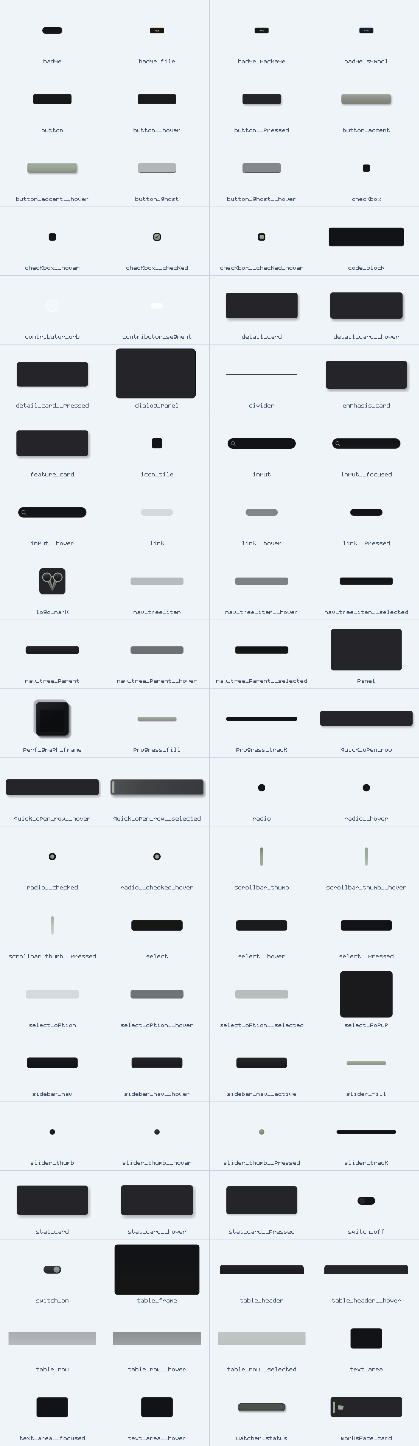
It can also do more renderer-native experiments that would have been awkward in SVG.
For example, I have an organic_edge effect now. It can turn a clean rounded rectangle into a slightly hand-painted edge before fills, strokes, shadows and inner effects are rendered.
That is not something I want to describe as a generic SVG filter graph.
It is a UI renderer feature.
So it belongs in the UI renderer format.
Linked Components
Another thing I struggled with from the start is linked components.
A lot of UI assets are stateful.
A button quickly becomes:
buttonbutton__hoverbutton__activebutton__selected
Those states usually have slightly different vector data, but they are still the same component.
Most of the metadata should be shared. The slice type, bounds, padding, layout role and atlas relationship often do not change just because the button is hovered.
This was awkward in the old pipelines.
With SVG files and external JSON, I had to keep these things linked by convention. That is exactly the kind of thing that slowly breaks once you start iterating.
With .mvg, this can live inside the component file itself.
Something like button.hover is not a weird external naming trick anymore. It can just be part of the format, closer to how CSS treats states.
That is much better for the renderer, but also much better for AI. It can see that the states belong together and that the metadata is shared.
This is not just theoretical anymore either.
For Vigil I now have focused-state asset art across the current themes. Things like:
button__focusedcheckbox__checked_focusedselect_option__selected_focusednav_tree_item__selected_focusedsidebar_nav__active_focusedworkspace_card__focused
Those are all slightly different visual states, but they still belong to the same component families.
That is exactly the kind of relationship I wanted the format to understand.
Current State
MVG is no longer only a sketch.
For Vigil, it is basically at the point where it can own the theme asset pipeline.
The pipeline is pretty direct now:
.mvgsource files- validation
- rendering
- contact sheets
- atlas packing
- export into the app
That is a real pipeline.
I do not want to pretend .mvg is some finished universal format. It is a small project-specific format that came out of a long chain of failed workflows.
I am also not sure yet if I should release MVG itself.
Maybe it stays an internal tool.
Maybe the idea is more useful than the exact implementation.
But that is also why I like it right now.
The constraints are finally in one place:
- Software rendering.
- Asset-driven UI.
- 9-slice metadata.
- AI generation.
- Theme colors.
- Atlas output.
- Scale-specific rendering.
- Smaller slice modes like 3-slice when they make sense.
- Linked component states.
- Theme fonts and shared icon sets.
Before this, every attempt had one part that was nice and one part that made the whole thing painful.
- SDF looked nice but was too per-pixel.
- Vector rendering worked until the assets got complex.
- Pixel art 9-slices proved the renderer but looked wrong.
- SVG generation made the UI exciting but created a metadata mess.
- Affinity gave me control but made the source format closed and the workflow slow.
- The PNG workflow showed the final output but still required too much back and forth.
Micro vector graphics is the first attempt where the format, renderer, metadata and AI workflow are all pointing in the same direction.
Maybe this could be done better. It probably can.
But for the first time in this project, I can make software-rendered UI assets that look good, regenerate them, pack them, keep the metadata attached, and still stay inside an Odin workflow.
Looking back, I probably should have thought more critically about the approach much earlier.
I kept going from one idea to the next: this is the only feasible way, this should get me to the result, this new plan will fix it.
That cost a lot of time.
But sometimes you only find the shape of the problem by struggling through it.
The funny part is that the actual project was mostly done. I mainly wanted a more handmade, better-authored theme for it. Then asset generation bit me in the back and sent me down this whole pipeline problem.
The next thing I want is a nicer viewer or inspector around the files.
I still want a visual representation of everything when needed. Maybe that later becomes a small editor where I can edit .mvg files directly and see the metadata next to the rendered output.
I already have an early version of that direction:
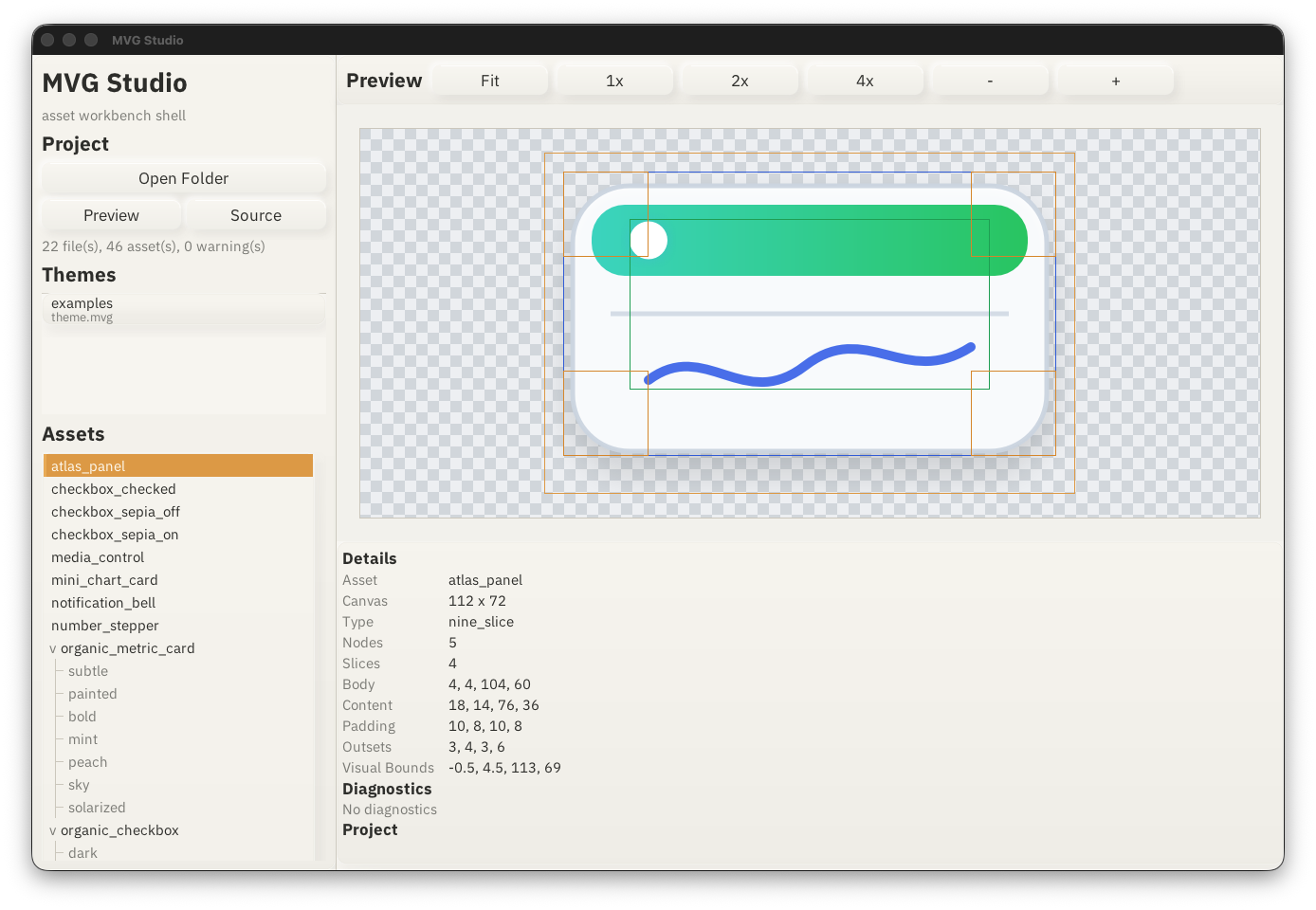
I am calling it MVG Studio for now, but I do not know what happens with it yet. Maybe it becomes a real editor. Maybe it stays as a private inspection tool.
That is fine either way.
But the important part is that the foundation is finally simple.
- Simple text files.
- Validation.
- Rendering.
- Inspection.
- Atlas packing.
- Theme experiments.
That is a crazy good pipeline compared to where this started.
So the takeaway is pretty simple.
If you are interested in creating your own UIs with software rendering, the general idea of atlas + metadata is worth looking at.
Maybe .mvg itself is not the thing you need. I am not even sure yet if it should be released as its own thing.
But the overall idea works for me:
- Author assets in a format the toolchain understands.
- Keep the resize metadata next to the art.
- Render the assets at the scales you need.
- Pack them into an atlas.
- Let the runtime do the cheap thing.
The hard part is getting to that atlas and metadata without making the workflow terrible.
That is the part I struggled with.
And that is also why this tooling might reach outside the niche project it came from.